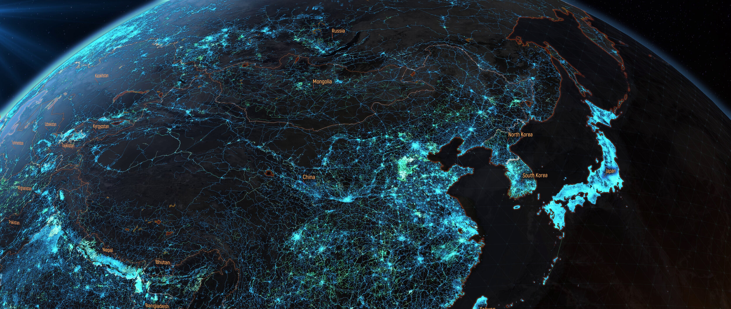
Visualising OpenStreetMap
Straight off the bat – I use OpenStreetMap (OSM) on nearly every visualisation I produce for Ito World. It is vital for enabling us to derive insight, create narrative and visualise the part of the world our project resides in. Most people reading this blog will be aware of what OpenStreetMap is but for those that don’t it’s…
a collaborative project to create a free editable map of the world.
The community digitising, editing and checking this dataset is huge and the amount of spatial data that is being created is vital for many of us data visualisation practitioners to visualise our work.
I wanted to create a side-project that celebrates this community by visualising, in different ways, the sheer volume of work they do on a year to year basis. I find it incredible seeing how our world has been built up by this dataset and hopefully you will too with the help of some of the below visualisations.
It’s worth noting that in all of these visualisations we are showing when the first version of that road link or building was added to the database. We don’t show anytime a road was edited either geometrically or via an attribute.
My project began with Prague. https://www.bestofosm.org/ is a wonderful resource to find areas in the world where OpenStreetMap users have gone above and beyond in their comprehensive mapping of places. Praha (Prague) is one of the most incredibly detailed cities in terms of map contributions in Europe.
The visualisation shows how roads and buildings have been added to OSM since 2010. In its gif form it’s a little quick so be sure to check out the hi-res Vimeo link below.
I wanted to scale up the visualisation after Prague and show the road additions at a much higher level. I decided to visualise part of India as the below video will show.
There is something intrinsically fascinating and almost mesmerising about how these roads were built up over time. However, it isn’t just road networks that we can visualise. OpenStreetMap is comprised of so much more and one aspect I found interesting was natural water features in North America.
The project is still ongoing in between other more pressing projects so I intend to add to this blog as and when something is produced. In the meantime here are some other visualisations of OSM on a large basis…
