
Transit in Motion
An exploration in visualising the patterns of public transport in 2020
Transit in Motion is a culmination of a lot of different analysis and visual styles all relating to public transport patterns in 2020. The resulting series of animations show public transport in a different light, a more abstract and conceptual view of the beating heartbeat of various cities. It’s my first attempt at really trying to turn insight into DataArt, check it out below!
The end video, as playful and fun as it is to watch and as it was to make, was actually the result of a long period of data archiving and analysis into how public transport was affected during various ‘Stay at Home’ and ‘Lockdown’ issues within a variety of cities throughout the world. To best understand the visualisation and how it was made I wanted to delve a bit deeper into the data that went being the animation, and to do that we need to go back to the beginning of the pandemic.
Data Collection:
When Covid-19 started impacting the wider world in terms of forced shutdowns in cities I was fascinated by how restricting social movement could impact public transit mobility within urban environments. The company I work for, Ito World (www.itoworld.com), specialise in archiving, improving and maintaining public transport feeds for companies like Apple and Google and actively store real-time feeds for a number of cities. I was curious to see if lockdown had an effect on the schedules of public transport i.e. were agencies reducing the numbers of buses on roads do to lack of demand, or were they putting on extra services for key workers?
Some of these questions could be answered at generic levels; whilst we can say where buses have been, at what time and how frequently we don’t, however, have information of ridership, who is on the buses, how many people and for what reason. So any analysis performed is caveated with the fact that we are only looking at observed locations of public transport.

Data Statistics:
There are many incredibly talented folks at Ito World who know a lot more about the ins and outs of data archiving and if you have any specific questions on the data ping us a message via our website, but for the purposes of this blog I will keep it fairly simplistic in terms of how I access and analyse the data.
Whilst Ito archive a huge amount of public transport for cities not every city has a GPS location in it’s feed packet. We are able to look at schedule info and infer locations however I wanted to try and keep this simple so I only looked at cities where we have a GPS fix for that bus location. These cities ended up being: Rome, New York, Los Angeles, Philadelphia and Toronto.
Starting with Rome I began accessing the daily feeds - this took a while! Feed packets are recorded every 2 seconds of the day so each day had roughly 43,200 json files to parse and append. So what does that look like in terms of size etc?
4.1 million locations recorded per day
1,540 unique bus id’s
200-400mb csv files once appended
New York was decidedly larger coming in at around:
14.8 million locations recorded per day
4,488 unique bus trips
2gb csv files once appended.
So these stats multiplied by roughly 6 weeks meant visualising patterns is pretty unwieldy! I needed a better way of simplifying the data…

Data Analysis
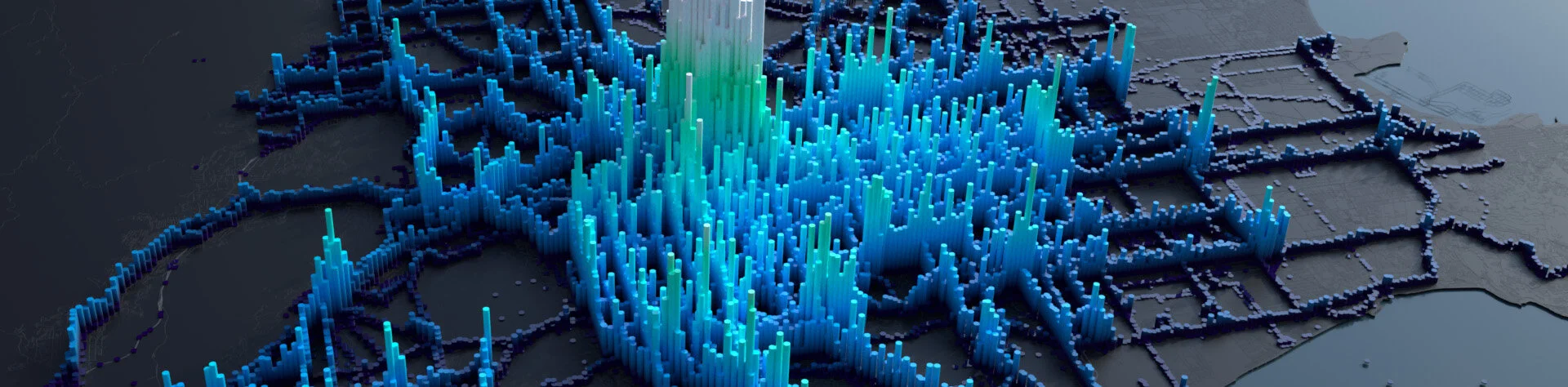
I decided to process the data into daily averages based on a grid binning technique. I would designate a grid, granular enough to notice patterns along roads but generic enough not to give too much detail and use binning the count of unique bus id’s in that grid for the whole day. So my 4.1 million rows turns into ~10k grids with an overall count of buses which is a decent proxy for activity level at different areas of the city.
The ‘pivot’ or ‘binning per grid’ was done using in-house software at Ito World but could just as easily be done in any spatial software. Once I have 6 weeks of this data I was ready to animate it over time to visualise the change (if any) in bus schedules/activity over the lockdown period.

Data Visualisation
The visualisation style of these animations, which I will share below, are fairly simple. Each grid is extruded in accordance with the daily average count of unique buses within the grid. You can see in the example of Rome above that the taller and darker the pillars are the higher the bus count is, typical of what you would probably see around an busy urban city centre.
The interesting element is the time progression throughout February to April when the various ‘Lockdowns’ are issued. You can clearly see a reduction in total activity for Rome following the lockdown issue. The calendar widget serves as a secondary metric which colour codes the day in accordance with the total activity for Rome, as a whole. The darker the colour of the calendar the grid has the more activity it has. There are clear patterns of weekend activity which can be made out by the overall dip in pillars and lighter colour gradient on the calendar, you can also notice how lockdown affects the total daily activity in the following weeks with a reduced activity level in some of the cities.
Each city has it’s own patterns and I find it fascinating to see how reduced social mobility has affected public transport. Of course we need to remember the original caveat in that we are assuming these buses have people in them, we can only comment on the scheduling of the services rather than the occupancy of passengers.

From Insight to DataArt
Evolving a design
Usually after one of these projects I down tools and move onto something else but something about the rhythmic pulse of the transit in motion made me want further iterate on it. I was interested in abstracting the data, removing the notion of place and focusing primarily on the pattern and pulse of the data.
By focusing on something that is usually a by-product of my animations and making it ‘front and centre’ gives me a bit more room for creativity. I don’t need to worry about occlusion of features, I don’t need to worry about creating a sense of place with context or using logical colour schemes, I can just visualise the data in the most abstract and weird way possible! Of course the interesting element to all this is it is based on real data, data that took weeks to process so there is hidden meanings to it. The purpose of it isn’t to be consumed with a logical conclusion, it’s purpose is simply to emphasise the organic beat of a city in terms of it’s mobility patterns.
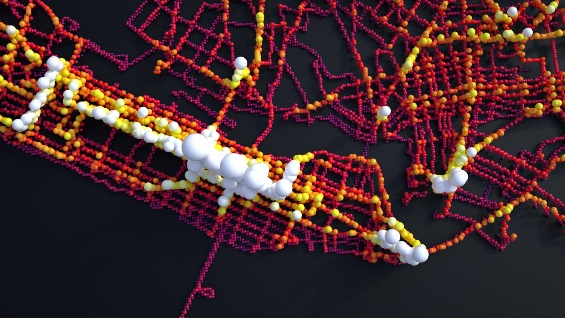
So how to get creative with it… Well I had two styles that I wanted to explore Tendons + Orbs (for lack of a better name).
Tendons
I initially wanted the explore this idea of a moving surface/mesh - kind of like an ocean that surges, I liked the idea of linking this to the data. I couldn’t quite figure the methodology to do this right (!) so I settled on creating an abstract mesh by spawning hundreds of connections between my data points. The result was far nicer than I expected. Each tendon has a physicality to it as it is rendered using Octanes (3rd party renderer) hair shaders which means you get a lovely bouncing of light on the glossy strands. The pulse of the data rising and falling is wonderfully hypnotic but the individual shots below are some of the interesting imagery I have ever created.
There are clear patterns to the data’s peaks and troughs and the cities, although devoid of context become kind of recognisable by the coast lines or data extent and general urban form of the city. The connections don’t have a logical link, they just link to the 50 closest points that are within a certain distance. Perhaps there is anothere evolution of this design that applies a bit more logic to how the connections link but for now please enjoy some very abstract depictions of bus activity in cities below.


Orbs
The next design style I wanted to explore was ‘scaled particles’ or Orbs as I like to put it. This was just an iteration on the above without the connections, in this case the height of the orb was linked to the height of the pillars in the ‘insightful’ visualisations earlier one. The orb is scaled in accordance with it’s value for activity levels so higher and larger orbs depict more activity. As with both of these visualisation styles there is also a colour gradient applies to emphasise the activity level, and in the case of the ‘orbs’ there are some glowing particles also added for no other reason than they look cool!


Transit In Motion
The final animated version is below. Being my first proper foray into abstract art I hope it works as both a concept and an enjoyable piece of data animation. I tried to find a music track that linked to the pulse of the data and was partially successful however this was pretty tricky!
Transit in Motion 2: Milan’s Buses
I enjoyed the abstract nature of the first project so much I decided to try my hand at it again with the below visualisation. Turning Milan’s schedule bus services into a kind of marble run with each line being on a different elevation this animation shows a very conceptual view of bus movement through Milan. Each line has a tension applied to it, a transition seen in the opening seconds, in order to make the routed lines more fluid.
Much more focus was given to camera movement and sound for this visualisation with sound effects emphasising the line transition and a more mellow music and targeted camera movement for the main animation.