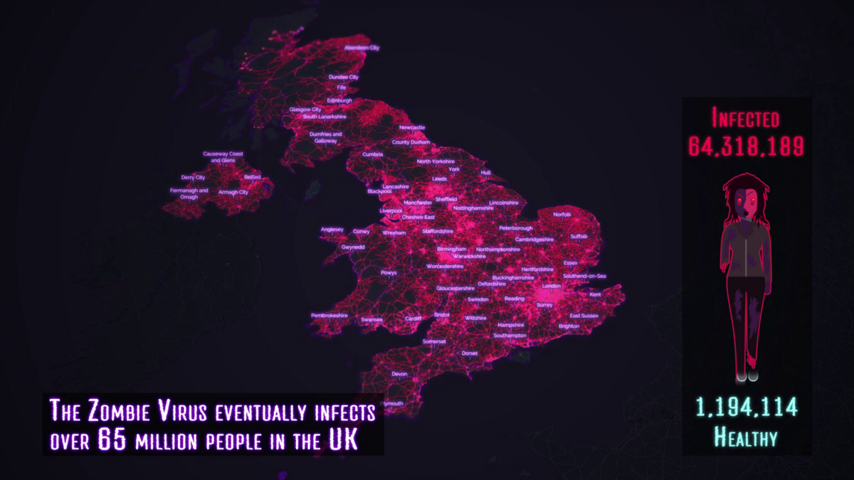
At the end of October Ito World lurched away from business as usual. I donned the hat of an amateur epidemiologist and published a test-bed visualisation imagining how a zombie virus might spread throughout the UK…its origins: Manchester!
What I thought would be a fun chance to flex some design muscle, quickly morphed into a rather complex creation.
If you’re hungry to find out how we created the visualisation and what data, visualisation techniques and design decisions helped evolve it read on…
Concept:
Being a horror fan I loved the idea of mapping a zombie virus. I wanted the visualisation to be effective at two different levels:
1. A detailed city level look at how a virus could spread along every street and walkway, propelled by local Metrolinks.
2. A wider look at how the UK could become engulfed with help from our rail infrastructure.
Data:
Data is extremely important as this drives our visualisations and the design software we use.
OpenStreetMap
OpenStreetMap is a great routable network to base the zombie wavefront on, and for the initial stages I wanted to use every available road classification. The benefit of mapping zombies? They can go anywhere — no need to worry about one way routing or prohibitive road classifications!
Time wasn’t a metric I wanted to focus on, the complexity of mapping against real time was too tricky (given my own time constraints) so I made sure road speed wasn’t a factor, the pattern of the wavefront was what I most wanted to visualise.

Metrolink Manchester:
I imagined the zombie virus being propelled by the Metrolink and I was able to source a crude network dataset for the Metrolink. The aim was to spawn separate wavefronts as the Metrolink hit various stations, simulating the zombie virus spreading to wider parts of the city. First I routed to every station from Piccadilly Gardens, this gave a duration time for each station. I then used that duration time as a start time for the wavefront. When the animated Metrolink hit the stations the wavefront spawns creating a lovely effect.

Rail Network
I used the rail network from NAVTEQs StreetMapPremium dataset, as I knew it was routable, it’s not perfect but works well enough as a concept.
Having taken over Manchester, I imagined the highly mobile zombies using the rail network to help infect more areas. The concept was similar — route to every station in the UK from Manchester to find the duration and thus the start time for my wavefronts.
I also invoked the right of creative license for the ferry route to link to Northern Ireland. Isle of Man/Wight (anywhere else I forgot) please don’t feel too left out — you’re official safe havens!

Having over 800 wavefronts spawn is a bit of a system hog so I needed to generalise my OSM network to account for this, everything from motorway to secondary classification was taken into account which gave a nice enough granularity to show how the virus travelled between villages.

I also utilised Ordnance Surveys Open Local Map for the building footprints during the initial stages, at the initial zoom levels this worked nicely in showing the build-up linked to the wavefronts.

The last dataset I wanted to utilise was ONS mid-year 2016 population totals as a proxy for the amount of people infected at different points.
The tricky part was how to route to each one using the wavefront hierarchy. I wanted to utilise the rail network first to route to the stations and then route along road networks to the remaining authorities. Unfortunately I didn’t have enough time for a two tier approach, but luckily most authorities are in close proximity to train stations so routing along rail networks worked well enough.

Visualisation Techniques:
As I mentioned earlier I saw this project as a chance to have fun and try out some new techniques. At Ito World we’ve been developing a lot of new visualisation styles recently and elements of the below can be seen in many of our projects, however I wanted to try and bring them all together and utilise them in a way that assisted the visual story telling process.
The gifs may take a couple of mins to load but are worth the wait!
Wavefronts
The basis of the visualisation and a really stunning way to show growth along road networks. The technique takes a geographical position and start time and routes along each road network similar to how a growing Euclidean distance might work. The technique stops when it reaches another wavefront so it’s ideal for showing a gradual build up.

Plasma Tracers:
Plasma tracers are a great way to show the flow of a vehicle and were utilised heavily throughout this project in relation to the metro and rail links. These tracers were placed on top of a growing linear geometry to show the head of the moving networks — the tail remains clear as the wavefronts develop.

Ring Pings:
An exaggerated view of what the pings look like is shown below, these were utilised to show the zombies reaching a station.

Building Reveal:
Perhaps a bit of a hacky way of showing building growth here, the effect is made by compositing a very thick line (made by the wavefront) over the top of a building network though a ‘multiply node’. Effectively any building under a buffered line will show, creating the illusion of buildings growing along the wavefront as they become infected.
Design:
I had a lot of fun with this design from the vectorised zombie lady to the glitch effects on the final video. There is a distinct colour palette in play which was inspired by Plague Inc., the ‘radical red’ fused with ‘electric violet’ and plenty of glow looks awesome!

The basemap is a custom Mapbox style we have developed for use in our Ito Motion product, aptly titled ‘Ito Midnight’. The only alteration I have made is to remove the labelling in favour of a more custom approach.

Labelling is always really important for any map base visualisation and as tempting as it was to use Mapbox’s lovely scale based labelling, having the labels obscured by the data is a classic error. Instead I opted for custom labels where I had more control over the appearance and could brand them in line with the red-violet palette.
I used a ‘punch out’ technique to create a halo type effect on the text. This involved blurring the text to create a white mask, I then inverted the mask using various compositing nodes in our software and used this as a multiply effect on the wavefront animation — creating a knock out halo rather than a solid colour. I also used some lookup magic to make the labels only visible once the wavefront reaches various towns.

There is a slight disconnect between the map labels and the glitchy info-graphic labels. Map labels are tricky to get right and font is a big influencer in this, I opted to keep the map labels clean (Raleway) as applying the glitchy infographic font would have made them illegible. The narrative labels utilise a really cool font I found called Director TT and looks great in combination with the glitch effect utilised at various points throughout the visualisation.
The Zombie Lady
I like to augment my visualisations with little infographics and had the idea to progressively show a vectorised lady becoming a zombie. The rate at which this happens is proportional to the infection rate.
I have noted that rather than creating a zombie lady I have in fact created a zombie brave-heart hybrid! I can’t take full credit for the original vector art — Adobes stock vectors are a great starting point however I did enjoy zombifiying it!

Finally the finishing touches! I wanted to create a constant static noise throughout the visualisation and found some great royalty free static which I composited over the top of the intro and outro. I did want to apply it to the map but it became a bit over powering. I also loved the idea of having a persistent glitch effect mildly inspired by the opening of The Outer Limits!
The glitch was produced in after effects by mapping a displacement channel over the visualisation causing it to distort for a short period. I also added some chromatic aberration to really emphasise the glitch.

The last element was adding the music, which was tricky in itself! During some of the early concepts I had Muse’s Isolated System backing it, featured in World War Z, however I doubt Muse would let me use it so instead opted for some royalty free bass heavy horror music which I think works well.
Offcuts!
This was the initial intro slate I came up with which was pretty dull in comparison. I liked the idea of building up a story but ultimately it didn’t grab enough attention to draw people in. Also I’m not sure Public Health England would have let us get away with including them!

Some early concepts for info-graphic element were a little morbid!

Software:
Much of the Zombie geo-animation was created in Designer, which is a powerful node based visualisation suite built by Ito World. Its real-time feedback means it’s great for me as a designer to create high-end visualisations without worrying about lengthy render times!

In addition to Designer, I also utilised QGIS during data preparation. Finally I used Adobe’s Creative Suite (Illustrator & After Effects) for much of the post processing effects which you can see in the final composite.