Like branches of coral they have a pattern and a function
For the past six months I have been fascinated by the concept of making city networks look like living corals. The varying patterns of urban forms are inherently dictated by their road network; a complex, seemingly organic connection of links moving people across their city. Like branches of coral they have a pattern and a function, I chose to expose this pattern and manipulate it to become something far more conceptual. However, whilst being incredibly beautiful they are derived from various geo-spatial analysis of drive-times catchments making them somewhat informative as well.
Kantar Information is Beautiful Awards 2018
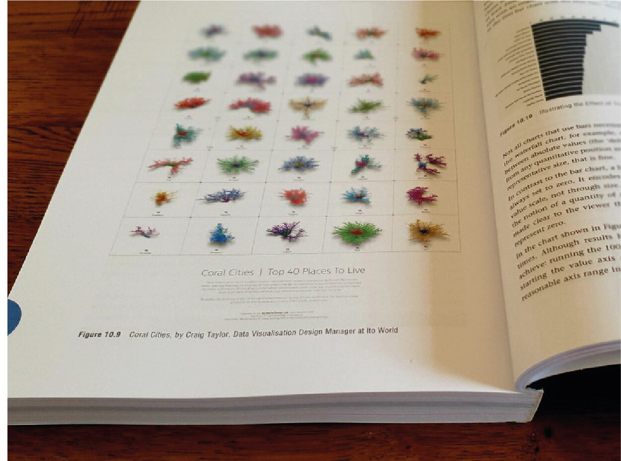
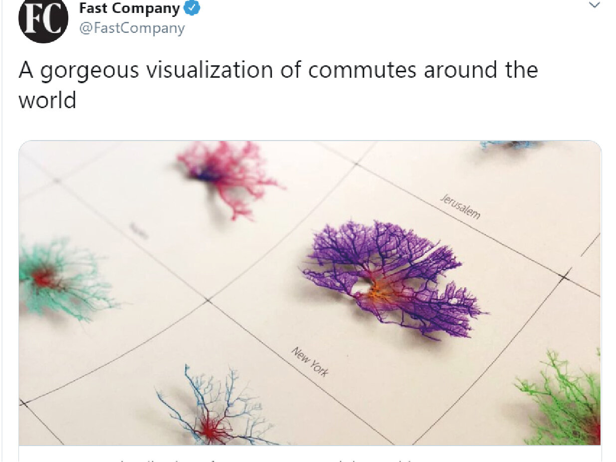
What makes a great city? Is it political stability? Low crime rates? Access to education or healthcare? We took one metric, looking at how easy it is for people to move within cities. We calculated how far you can travel (by car) from each city centre, in 30 minutes. The resulting ‘coral formations’ show transport data in a new way, revealing beautiful, organic forms. Each strand shows the arteries of a city, representing a possible route from the centre.
We applied this technique to each of the top 40 cities in Mercer’s Quality of Living City Ranking. The result is a unique perspective on how we move around some of the world’s greatest cities.


Having produced so many of these coral formations over the past 6 months I thought it only fitting to embark on the biggest application of them yet; to map, analyse and animate 40 of the most liveable cities. I felt the concept and visuals were strong however the list of cities needed to be relevant and less random as with some of my earlier ‘concept’ projects. I decided to utilise a similar livability index to the Economist Intelligence Unit but through a company called Mercer, who publish a ranking annually (https://mobilityexchange.mercer.com/Insights/quality-of-living-rankings). With Mercer’s permission to utilise their list we created the below for submission into the awards.
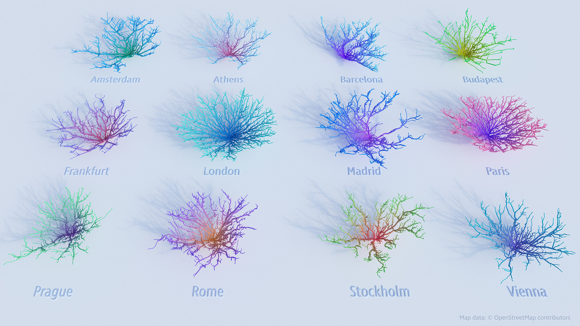
UK/European Coral Cities
My first attempt at a small-multiple approach to the project and analysed 30-minute drive time catchments from various cities in the UK and Europe. The drive-time analysis is based on a optimistic view of zero traffic and as such presents catchments far wider than you would expect to see.

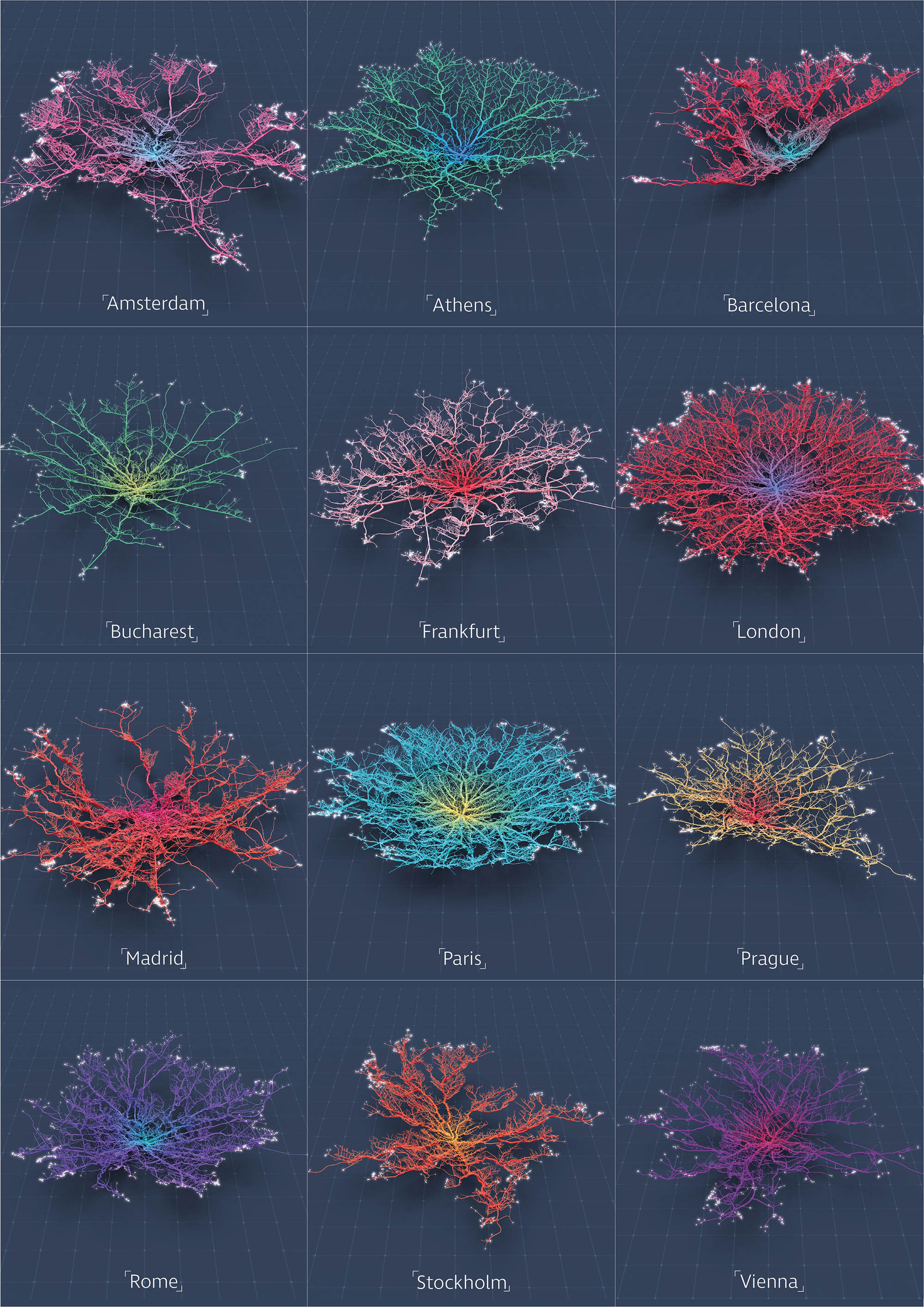
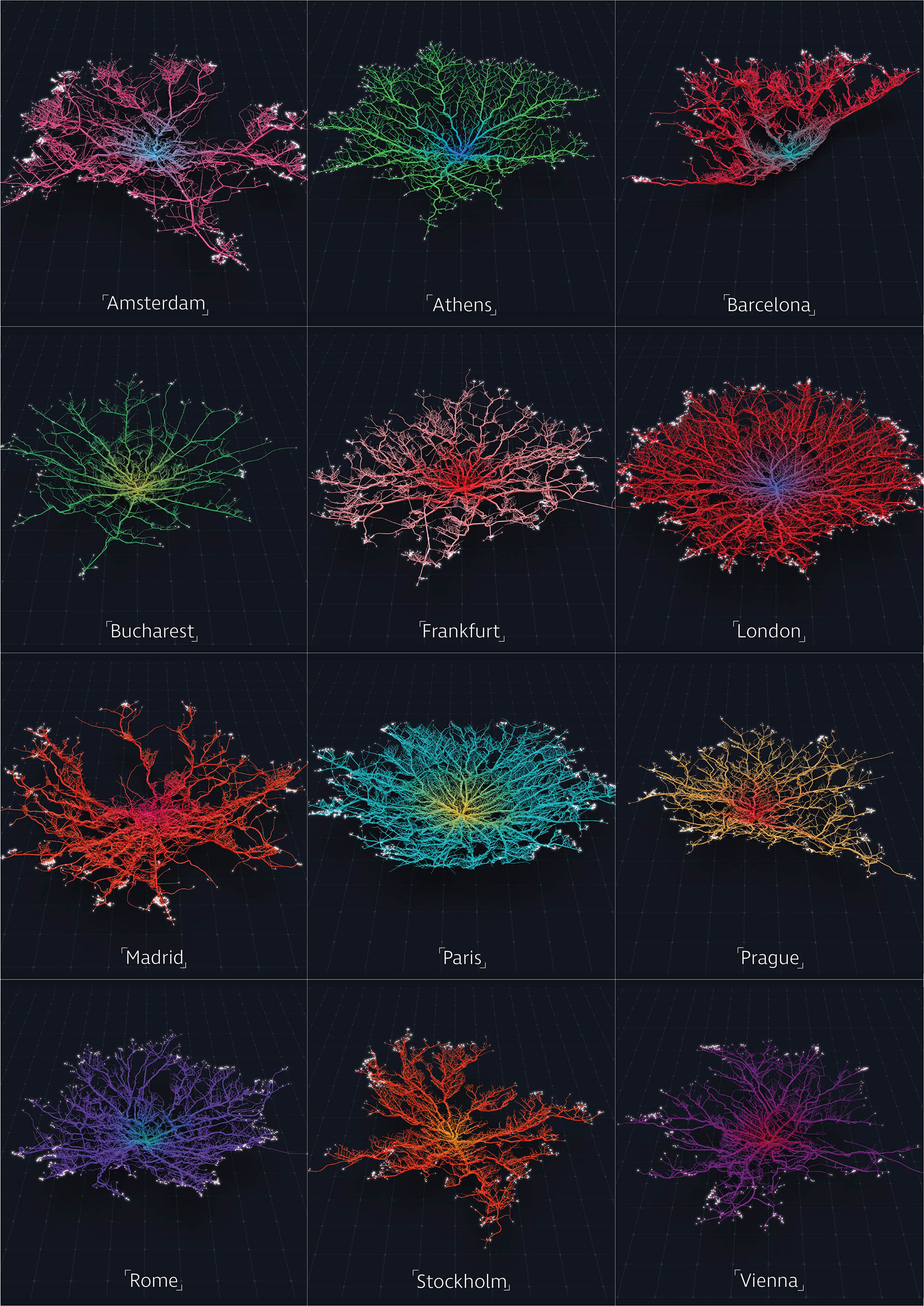
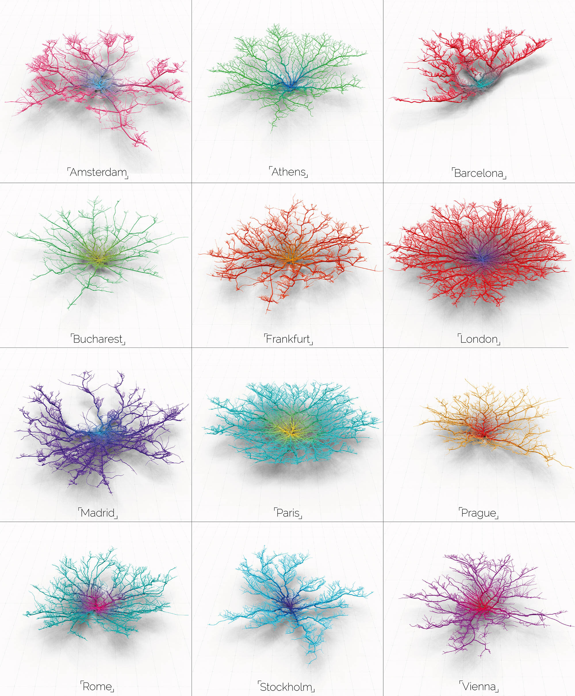
The high-resolution static images above shows the intricacies of the formations with clear patterns where physical features such as rivers, oceans and mountains impact the network. I also produced 4k animated versions seen in the below Vimeo links with the animation slowing down progressively towards the end of the video.
The Economist Intelligence Unit: Livability Index
Last month the EIU released their 2018 livability index which ranks all major cities to their livability index (http://www.eiu.com/topic/liveability). We thought it would be a great idea to produce a ‘Coral City’ version of this top 10 list and of course an animated version to follow.

Corals out in the wild!
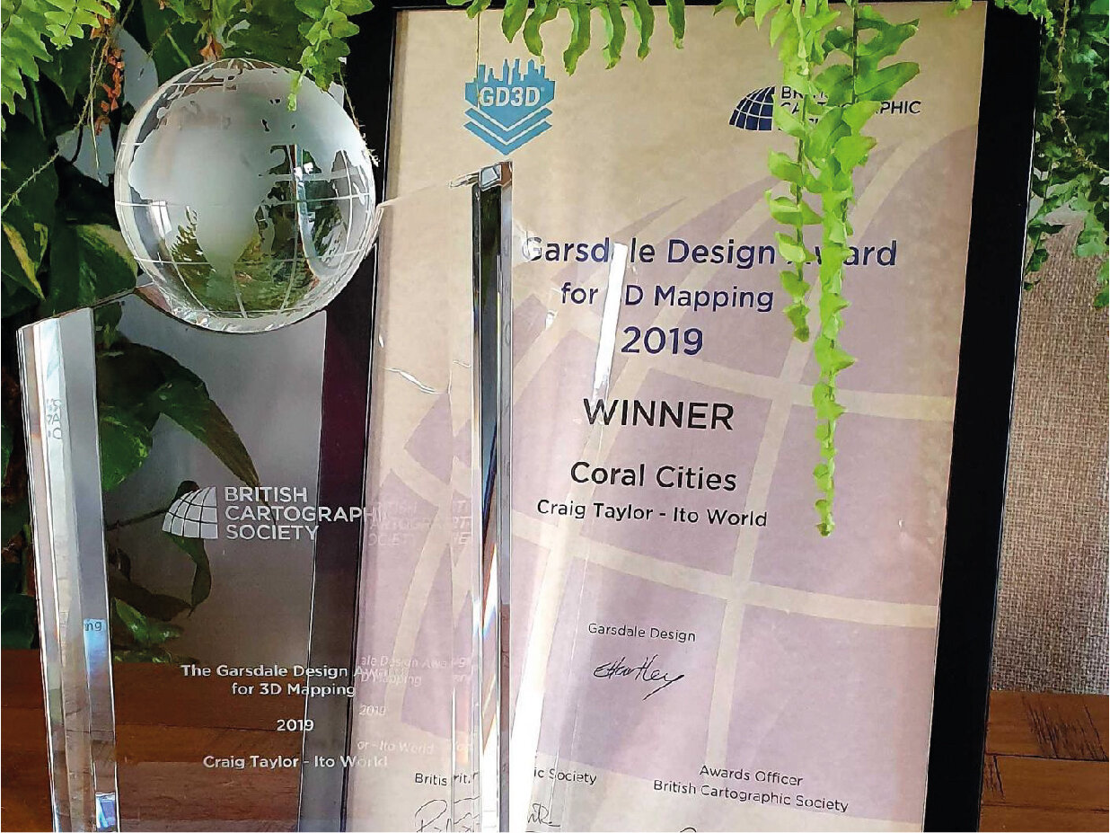
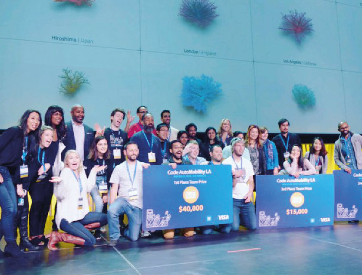
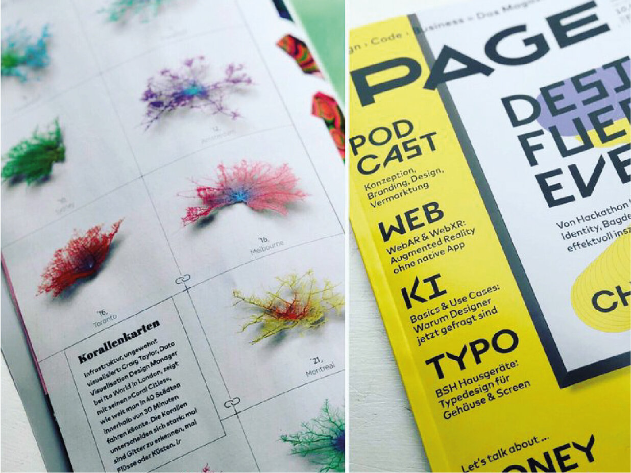
Over the past few years the Corals have made it into lots of cool publications and even snagged an award from the British Cartographic Society. The gallery below shows some of these publications and how the corals look in print.

How are they made?

Let’s explain exactly how they are calculated and what they are showing, to do this lets looks a little more closely at one of my favourite corals - Tokyo.
I start with a basic OpenStreetMap network for the city of Tokyo and the surrounding region. Using various methods I can then calculate the catchment area for a designated drive-time from the centre. At Ito World (www.itoworld.com) we have an in-house routing system which allow us to do this, however, there are a bunch of other methods and software which allow you to calculate drive-times (ESRI, PgRouting, GraphHopper, Here API etc). It’s important to note that in most cases the network catchment is calculated with zero traffic so the results are very optimistic. However, we have experimented with importing congestion based isochrones from the Here API and converting these to corals which has been fairly successful (see below)

The catchment analysis will give a rough area, I then need to turn it into Corals, to do this each vertex on a linear link is given a distance value away from the centre of the city. I can use this distance metric as a height value for the link, creating a 3d network, growing higher with distance from the centre.
I also apply a ‘weight’ value to the link, this isn’t anything to do with the road classification, however it is often linked. The weight is proportional to the number of links connected to the branch, so the thicker networks have more arterial networks connected creating a coral-like appearance, it also suggests busier sections of the routing network.
Each of the links then undergoes a ‘sweep’ with a rectangular geometry creating a physical presence with which we can apply ambient occlusion to during our render.
The colour gradient is purely an aesthetic addition and just maps the gradient from the centre. Animating the links to appear in order of distance results in a mesmerising coral growth…